Insights Summary
See what matters most-across safety and patient experience-and act sooner.
Insights Summary is SafeTower’s qualitative and quantitative analytics experience. It brings safety event data and patient reported concerns together into a single, powerful dashboard, giving teams true cross-module visibility into risk, patterns, and emerging issues.
By combining advanced qualitative analysis with dynamic quantitative visualizations, Insights Summary surfaces trends and relationships that are easy to miss in traditional, single-module dashboards built around basic quantitative charts.
One Dashboard. Three Ways to Understand Risk.
Insights Summary is organized into three complementary
sections-Summary, Trending, and Details—
each designed to answer a different set of questions and support faster, more confident decision making.
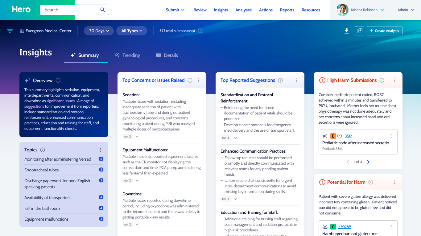
The Summary section provides an AI powered qualitative overview of a dataset selected by the user, spanning both safety events and patient reported concerns.
Using large language models, Insights Summary:
- Identifies the main issues and themes within the selected data
- Connects issues back to their source submissions
- Highlights high harm events regardless of how they were scored by humans
- Flags events with a high priority for harm
The high priority for harm identification is especially valuable for uncovering near misses and emerging risks—allowing teams to intervene proactively before harm occurs, rather than reacting after the fact.
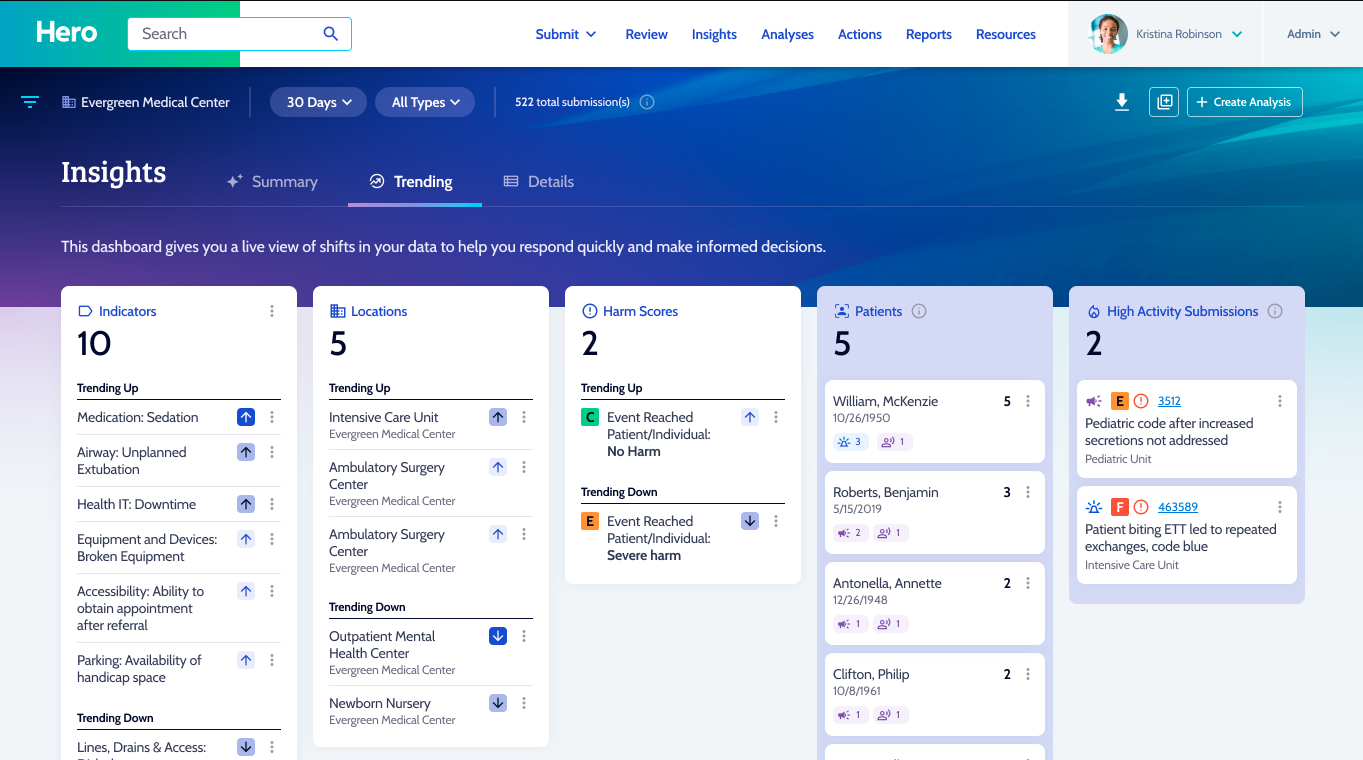
The Trending section helps users quickly understand where risk is increasing or decreasing across the organization.
- Identify indicators and locations trending up or down beyond normal thresholds
- Detect meaningful changes that may require attention
- Surface patients with unusually high activity or repeat submissions
By focusing on deviation from the norm—not just raw counts—Trending helps teams prioritize what truly deserves investigation and action.
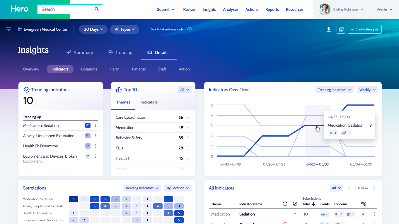
The Details section offers deeper quantitative exploration across data elements used throughout the SafeTower platform.
- Visualize trends by indicators, locations, patients, and other shared data points
- Compare safety events and patient reported concerns side by side
- Use correlation heat maps with configurable axes to identify relationships between variables
These advanced visualizations reveal connections and patterns that are often invisible in traditional, single module dashboards—helping teams ask better questions and uncover root drivers of risk.
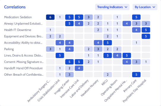
The Correlations view transforms complex data into an easy-to-read heat map, allowing users to compare two datasets at a glance and quickly spot meaningful — and sometimes surprising — relationships. By visualizing how categories intersect, patterns that might otherwise stay hidden become immediately clear.
Users can dynamically change the axes of the heat map to explore different combinations of data, making it simple to analyze trends across locations, indicators, harm scores, or other key variables. This flexibility empowers teams to move beyond surface-level reporting and uncover insights that drive focused investigation, informed decision-making, and targeted improvement efforts.
Analytics That Go Beyond Traditional Dashboards
Unlike competitor applications that rely on isolated modules and simple charts, Insights Summary is designed to surface meaningful patterns across datasets and domains.
By blending qualitative intelligence with multidimensional quantitative analysis, Insights Summary helps organizations:
- See risk earlier
- Understand it more completely
- Prioritize action with confidence